Thursday, June 10, 2010

LAST LAB!


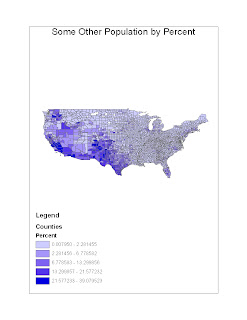
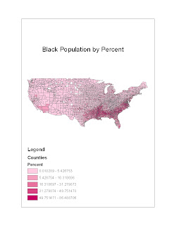
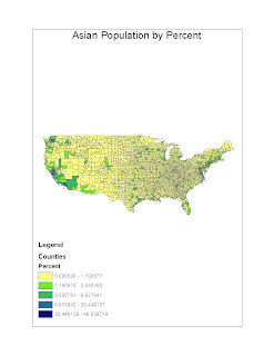
Each map illustrates the census data by county, while representing the spread of people who chose their race as either "Asian race", "Black race" or "Some other race" on the 2000 census, across the United States of America. The maps shows the percentage of the respected races per county. The maps illustrates the population distribution of the respective races. "Some other race" is considered to be a "non-standard" category in respect with the other race categories on the census. The "Black race" has the highest population percentage reaching roughly in the high 80%. This is a significant difference when compared with the other two maps. When viewing these maps, one can reflect on the different histories the races have had when comparing the population. There are probably different reasons why the "Black race" distribution has a larger volume than the "Asian race". It can go from hostorical, religious, or geographic reasons. None the less, it is interesting to observe the different maps.

I have had an extremely positive first impression on GIS. Its a brand new subject and captivated my interest. I enjoyed all the labs. Maybe at first it was fustrating because I did not know what I was doing at first, but with practice, I got a lot more comfortable and knowledgeable with it that kept me wanting more assignments. I now want to minor in GIS and hopefully find a job in the field, maybe DBMS. GIS is a powerful tool that can be used for many great purposes, from conventional to military. This class has helped me immensely in creating and observing GIS and I am grateful.

Thursday, May 27, 2010

Station Fires


The Station Fire in Los Angeles California on September 2009 was devastating affecting the entire city. Residents have not witnessed a fire as intense for years. There was two hundred fifty-one square miles of land burned.1 The fire was located North of Hollywood roughly in between Burbank and Pasadena. Two fire fighter were killed in fight to contain and put out the fire.2 The cause of the fire was considered arson and a homicide investigation had been initiated.3 This was an unfortunate event in California's history. In my maps, I choose to demonstrate who was affected by the station fire. In both my thematic map and reference map, each demonstrate a different viewpoint.

The reference map is an outline of Los Angeles. The map includes the station fire filled in red; the major roads and highways indicating where the mass population blocs are located symbolized in the transparent brown dots. I did this to stress the impact the station fire had on the citizens of Los Angeles. It was one of the largest fires ever. The people located in the station fire had to evacuate immediately and the people that were near the fire had to relocate as well.4 The reference map shows how intense the station fire was by the size and proximity of the fire.

The thematic map zoned in on the fire. It stresses how easy and quickly the fire was spreading and the main civic centers for instance schools and hospitals that were affected.. The legend includes the hospitals indicated in the yellow ambulance sign; the rivers in blue lines; the minor highways in purple; the station fire in filled red; the parks in the green leafy area; school districts in the green zones; and the hill shade value in black and white. The map gives another viewpoint on the station fire's intensity.

The thematic map shows the extent the station fire had the parks and nature reserves. It consumed a large percent of the parks negatively impacting the wildlife habitat.5 Hundreds of animals were trapped and died in the fires and most lost their homes. It will still be unknown the magnitude of the amount of animals lost.

Both maps give a good understanding on the effects the station fire brought onto the people of Los Angeles. From habitats to school districts, no one could hide from the fire. Even I remember the smoke clouds it caused that reined over in Orange County for a couple of days. Nothing good came out the fire all from a homicide. Millions of dollars were lost and people's lives were at stake. Hopefully, no one would ever have to experience a fire like that again

1Current Fire Information. California Department of Forestry and Fire Protection. Accessed October 29, 2009.

2"Station Fire Over La CaƱada Flintridge Threatens Thousands Of Homes - Cbs2.com." CBS 2 - KCAL 9 - Los Angeles - Southern California - LA Breaking News, Weather, Traffic, Sports - Cbs2.com. 30 Aug. 2009. Web. May 2010. .

3Winton, Richard (September 4, 2009). "Substance found near Station fire ignition point is key evidence in arson probe". Los Angeles Times. http://www.latimes.com/news/la-me-fire5-2009sep05,0,3683519.story. Retrieved May, 2010.

4Bloomekatz, Ari B. "Station Fire Is Largest in L.A. County's Modern History | L.A. NOW | Los Angeles Times." Top of the Ticket | Marking This Memorial Day Holiday with Kate Smith and Her 'God Bless America' | Los Angeles Times. LA Now, 2 Sept. 2009. Web. May 2010. .

5BELTZER, YVONNE. "Station Fire Takes a Big Toll: Wildlife Habitat Lost | NBC Los Angeles." Los Angeles - Local News, Weather, Traffic, Entertainment, Events, Breaking News | NBC Los Angeles. 4 Sept. 2009. Web. May 2010. .


Thursday, May 20, 2010

DEM

I choose to select where I live as my map of choice. I live in Orange County California on the border of Irvine and Newport. Its been my home for the last five years. The area includes flat plains as well as hill areas. The extent of the area includes:
Top = 33.83
Left = -117.97
Right = -117.52
Bottom = 33.53
The RF scale is 1:250,000

Below are all the required maps:


Thursday, May 13, 2010

Map Projections


These are my map projections. From the three main types of projection(Conformal, Equidistant, and Equal Area) I selected certain map projections that were interesting to observe and compare. The most difficult part of the assignment was not creating the maps, but organizing them in a presentable manner. I learned more about using ArcGIS in organizing than in creating the projections.

At first, I did not realize the significance in map projections or why there are a vast amount of different projections. I was frustrated because I could not understand what certain projections were showing. For example, the hammer and mollweide projection. I thought they were basically the same thing. I was asking myself, "What was the individual niche with those individual projections and why was it significant?" I slowly understood after completing the assignment about how each individual map help in obtaining information in GIS.

A great example on why map projections is significant is with flight aviation. When I flew to countries in Europe, I never understood the route the pilot took to reach the destination. We always went through Canada and Greenland to get to the destination. I always thought it was faster just going in a straight line. I now understand looking at the equidistant conic projection. It shows how mush faster it comparing it with the sinusodial projection. I never believed the flight attendants when they said its faster but now I understand why.

There is still so much to learn about ArcGIS and map projections but as time passes, the significance increases. Through GIS, there will be new innovations created for the future generations across the globe.

Thursday, May 6, 2010

Proposed Airport Expansion


Write a four paragraph review of your ArcMap experience that discusses the potential and pitfalls of GIS:

My ArcMap experience was unusual and stressful. I had trouble with the tutorial and required addition research in obtaining what was asked for. Once completed, I realized that I skipped a page of crucial directions that would easily saved me 30 minutes. Other than that, I enjoyed the tutorial. It was clear and helped me understand what I needed to do. Even though it was long and required patience, I believe I have a better knowledge with programming ArcGIS. It was a good thing the class had two weeks to complete the assignment.

The ArcMap program does show the potential GIS systems have and what can be accomplished. The ability to put vast amounts of detailed data into a map is incredible. GIS is a young subject of expertise and a growing business. Even some of the professionals of the program can learn something new that is of value. From Layering to comparing data and analyzing figures; It allows virtually anything with map making with little difficulty.

Pitfalls may include user friendliness. The average person cannot just sit down and expect to master the program easily like Microsoft Word or Paint. I needed a long period of time with trial and error to succeed. Much practice is need, but its worth it if you want to succeed in this field. Another pitfall may include data errors that will lead up to conflation. One must be sure the data entered is correct.

Overall, I enjoyed the assignment. Erin also told me I would learn from this and be a better person. And she was right! She helped so much and if any professor reads this blog, you should hire her in a heart beat because she is caring and wants all her students to do well, but learn the subject in doing so. The ArcGIS is an important program for geography.

Thursday, April 22, 2010

Lab 3

This is my Map

Thank you.. your the best

Neo-geography is about the freedom of creating a personal map for virtually anyone. Not only can anyone use it, the user interface is extremely simple that enables more efficient maps for public use. It is based on using a mashup, a mapping program such as “Google Maps”. Neo-geography brings some ethical circumstances such as validity or accuracy of maps. More importantly is trust. Neo-geography revolutionizes the horizon of mapping.

The potential neo-geography brings is vast. 80% of the world is locatable. With neo-geography, it is possible a 100% of everything can be located. There will be no blank spot on a global scale in all aspects imaginable. Also it opens a new door to the public. New programs can be made, more maps for the word, and a better understanding of geography comes with neo-geography.

Throughout history, maps were always trusted because professionals created the map. It is the same with GIS mapping. Yet with Neo-geography, some maps maybe inaccurate and if used, there will be frustration and disappointment. Also, there maybe some malware or viruses installed in maps that can destroy the computer. These problems arise with new technology, especially made public.

Overall, I believe there are more benefits than pitfalls with neo-geography. Opening new doors to the public will enhance the knowledge of geography and can help the envorinment.


View Daniel Yair - Lab 3 in a larger map